Fidelity Wealth Solutions
Small Business Retirement — Reimagine Product Experience & Design New Tools
The Challenge
Reimagine the end-to-end user experience for the Small Business Retirement squad within the Fidelity Wealth Solutions domain. This included conducting customer research, competitive analyses, creating storyboards, user flows, wireframes, applying the new Fidelity Design System and designing responsive, accessible web sites and applications for small business owners and their employees.
Small Business MARKETING PAGE REDESIGN
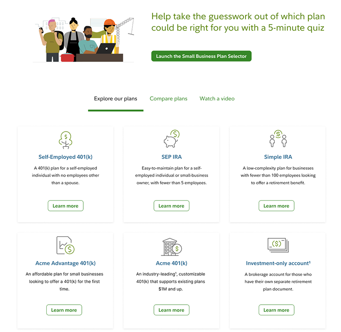
My first task was to improve the landing page for Small Business. We were about to roll out a new Plan Selector tool, so I featured that prominently towards the top of the page. I introduced tabs to reduce the amount of scrolling on the landing page. The default tab, "Explore our plans" included the addition of simple cards with links to learn more about the plans. All enhancements followed the new Fidelity Design System and passed accessibility reviews.
NEW Plan Selector Tool — live on Fidelity.com
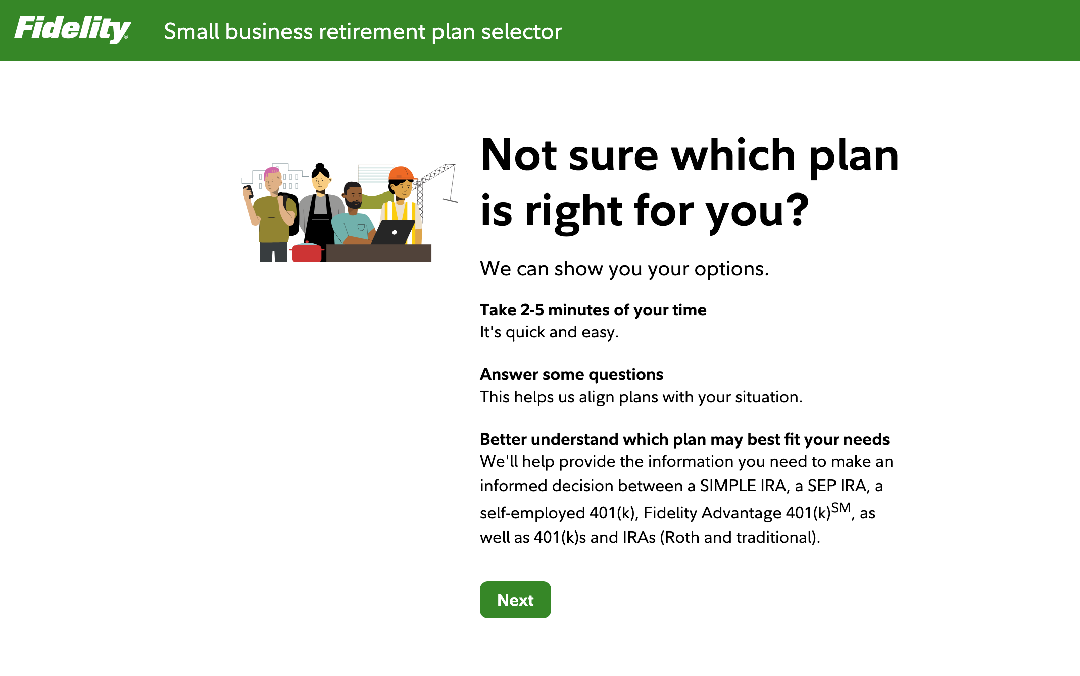
My team collaborated with the Workplace Investing team to create the new "Small Business Plan Selector" tool for small business owners. The approach we settled on included a few simple steps, each with a single question along with contextual help, and a results page that gave the user ranked results along with clear next steps.
Compare Plans TAB redesign
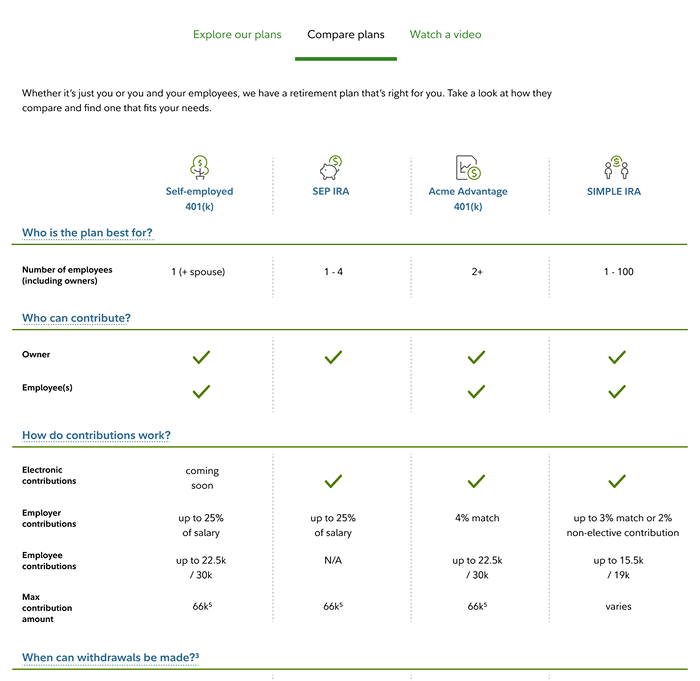
Another part of the Small Business landing page that needed improvement was the "Compare Plans" tab with a table comparing the four primary plans. User research showed that the previous design was too text-heavy and not suitable for viewing on a phone. I went with an approach that minimized the use of text and moved things like details related to each question in the left column into popovers. As user testing showed, these updates and the new responsive template were a significant improvement across all breakpoints, including mobile.
IRA Contribution Calculator — redesigned flow
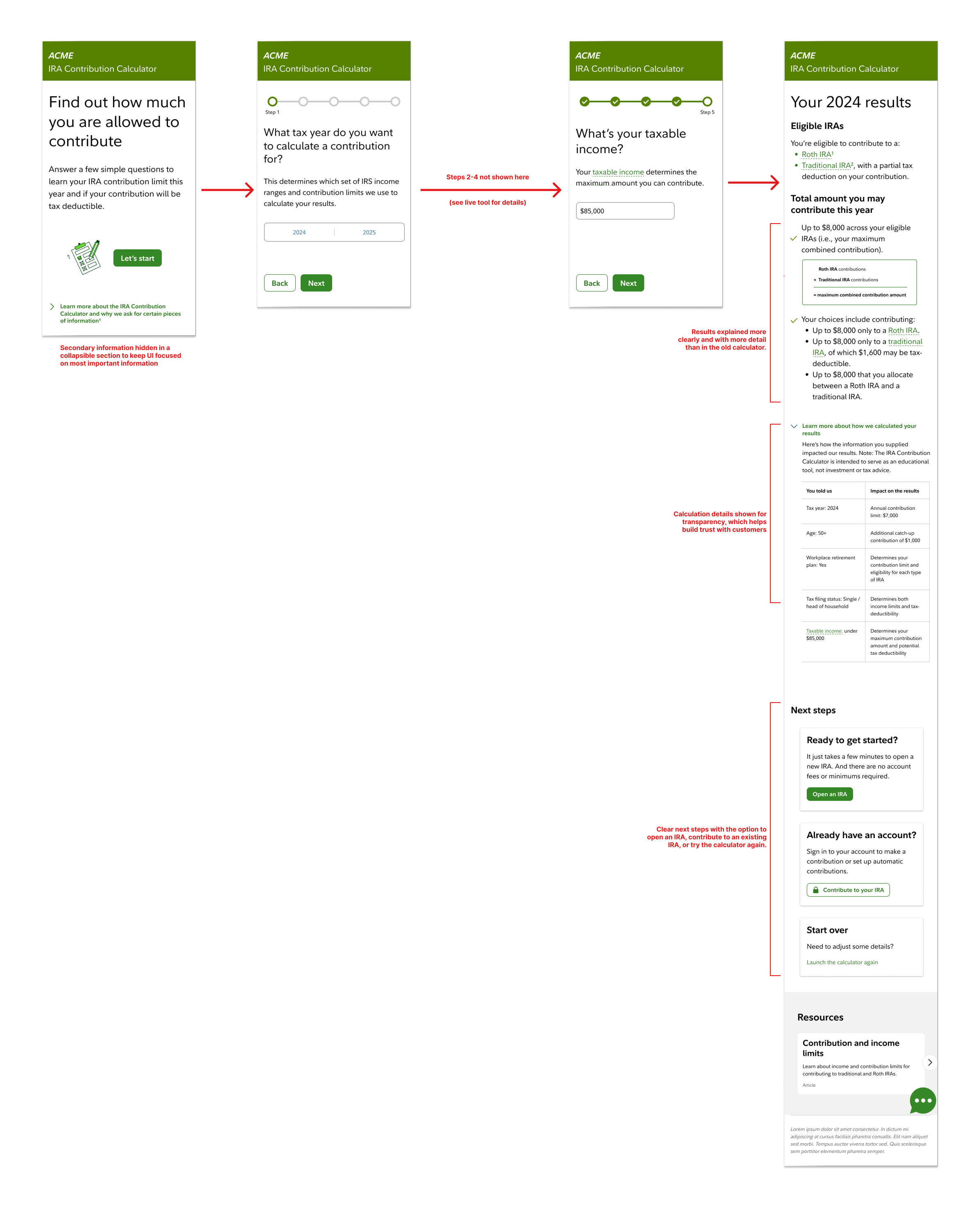
I conducted user testing on the original IRA Contribution Calculator. With a clear picture of where users struggled, I restructured the calculator's input sequence — reducing cognitive load at each step and surfacing the most relevant guidance at the right moment. Early concept testing validated the new flow, and the redesigned tool shipped as part of the broader Small Business Retirement suite.
SIMPLE PLAN MANAGER - WEB APPLICATION REDESIGN
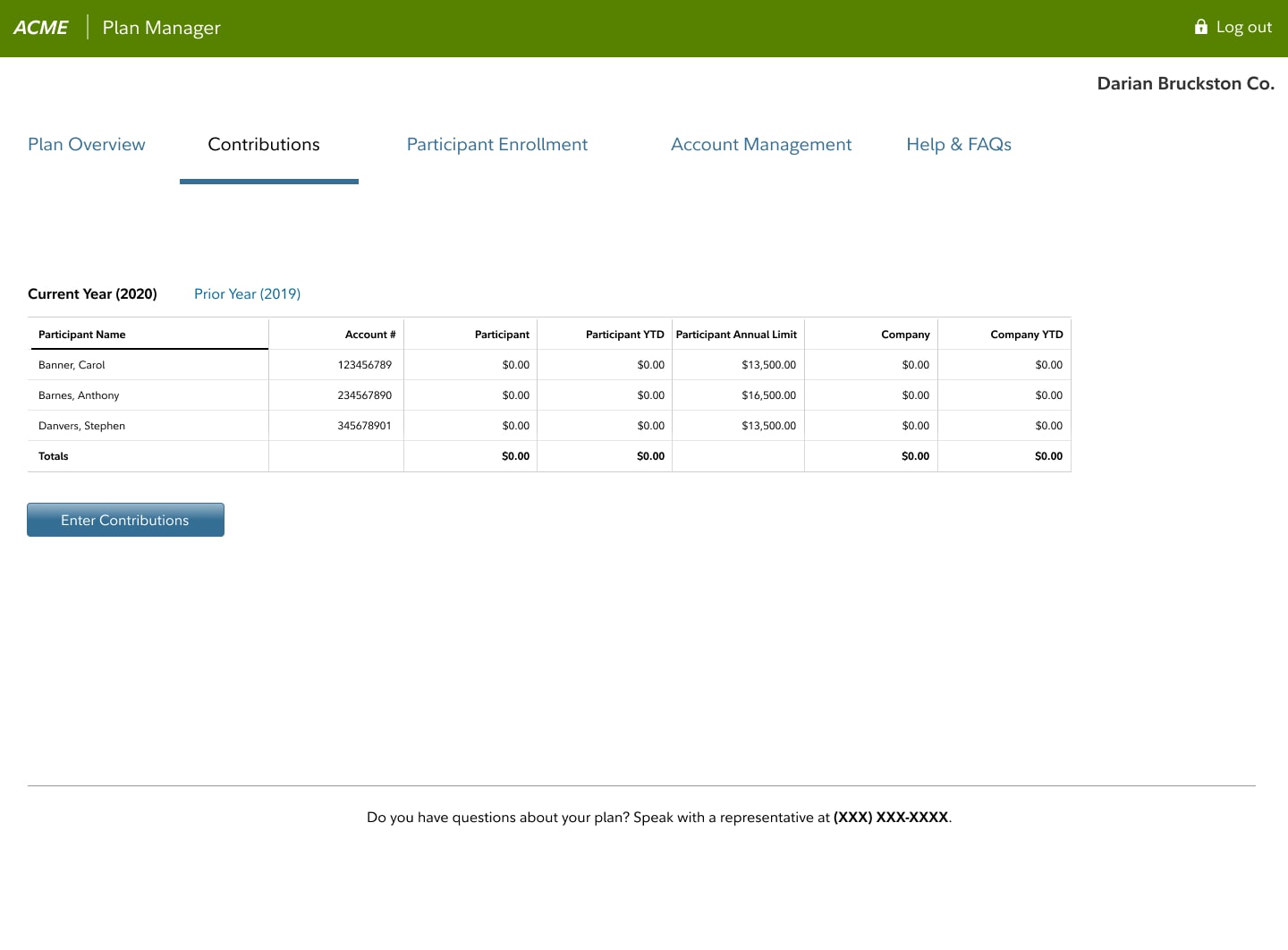
The SIMPLE Plan is a low-complexity plan for businesses with fewer than 100 employees that are looking to offer tax-advantaged retirement plans. There was visually outdated application already in market called "SIMPLE Plan Manager" that let employers and employees manage their contributions, but it had confusing navigation and page-level details. I was tasked with updating the look and feel to be in line with the latest Fidelity standards - and to make the application easier to use.
IMPROVED NAVIGATION AND PAGE-LEVEL USABILITY
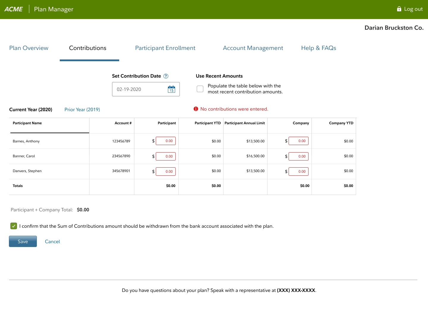
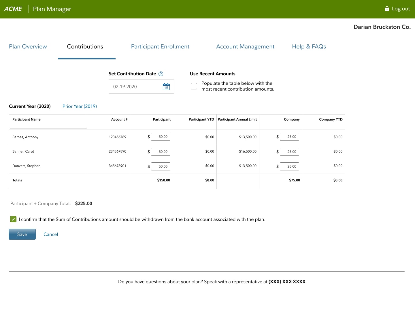
My involvement included reviewing the information architecture and page-level usability. I reorganized the navigation into fewer, easier to understand sections. Next I simplified the data entry and display of all tables. In some cases, I advocated for new controls and also an improved way to display errors. As a result of the redesign, Fidelity received positive feedback from users and fewer calls to the call center related to problems using the application.
My Approach
- Plan and conduct user tests and participate in competitive analyses.
- Create user journeys, wireframes, designs, and prototypes.
- Ensure compliance with Fidelity Design System and accessibility standards.
- Collaborate with product managers, developers, and stakeholders to deliver production-ready designs.
Deliverables
- User research & usability testing reports
- Competitive analysis
- User journeys & flows
- Wireframes & prototypes
- High-fidelity responsive designs
- Design system and accessibility compliance