U.S. DEPARTMENT OF COMMERCE
Reimagine Market Intelligence Service
THE CHALLENGE
While market intelligence is considered crucial to both new and existing exporters, there are currently many issues related to the creation of and access to market intelligence research and reports. Understanding the current state and establishing a plan to improve the service is a major opportunity for the International Trade Administration (ITA). This led to the following plan:
- Conduct interviews with employees (commercial and trade specialists) and customers in North America, Europe, Asia.
- Distill interview data into main themes related to pain points and opportunities for improving the market intelligence service at the ITA.
- Create storyboards and service blueprints to highlight the top areas for improvement.
- Begin to collaborate on a service design concept for an improved way of publishing, sharing and consuming market intelligence in the future.
MY APPROACH
- Work with ITA peers to plan the research, create the interview guide, conduct the interviews and derive main themes from the interview data.
- Meet with partners across the organization to share the main themes from the research and start to collaborate on a service design concept
DELIVERABLES
Storyboards and service blueprints


Create Storyboards to Begin the Design Process
- I collaborated with the Market Intelligence team and identified key areas to focus on with the storyboards, based on the top pain points and areas for improvement identified in the customer and employee interviews..
- The storyboards describe how customers learn about the new market intelligence offerings, how they gain access to the "Market Intelligence Center", and how ITA Commercial Specialists use it to produce, collaborate on and distribute new market intelligence articles.

Proceed with Service Blueprints
- The next step in the design process was to create service blueprints for each of the three storyboards.
- These focused on the overall experience, the interactions (between people, places, and systems), and what happens behind the scenes.
- My assignment ended at this point, but the plan was for the internal team to proceed with updating the service blueprints and continue with the design of a service design concept.
SMALL BUSINESS RETIREMENT
Product Experience & enhanced Tools
THE CHALLENGE
- Reimagine end-to-end user experience for the Small Business Retirement squad within the Fidelity Wealth Solutions domain.
- This includes conducting customer research, competitive analyses, creating storyboards / user flows / wireframes, applying the most up-to-date design standards and designing responsive web sites and applications.
- My main task was to work with the internal stakeholders and peers on the Small Business Retirement squad to come up with the best user experience for public-facing marketing pages, as well as tools and applications for small business owners and their employees.
MY APPROACH
- Plan and conduct user tests and participate in competitive analyses
- Create user journeys, wireframes, designs and prototypes
- Ensure compliance with Fidelity Design System and accessibility standards
DELIVERABLES
Wireframes, user testing plans and reports, user journeys, prototypes and pixel-perfect designs for both public-facing pages and post-login web applications

Promotion of New "Small Business Plan Selector" Tool and Enhanced Page Designs
- I collaborated with members of the Small Business team and the Workplace Investing organization to design a new tool that helps independent workers and small business owners pick retirement plans that best suit their needs.
- The updated page design also includes a simplified overview of the small business plans that Fidelity offers and updated resources.
User Research to Improve Key Content
- Another main focus of the redesign was to simplify the "Compare Plans" section, that was previously very text-heavy and especially hard to view on a phone or tablet.
- I conducted a round of unmoderated, remote user testing to ensure that the redesigned "Compare Plans" section (with less text, more white space, and added icons) was indeed an improvement.

Reimagine the IRA Contribution Calculator
- I collaborated with my peers on the Small Business team to create a new experience that is simple and engaging, easy for customers to understand and with clear next steps.
- I started by reviewing the overall IRA contribution experience and documenting the related user journey.
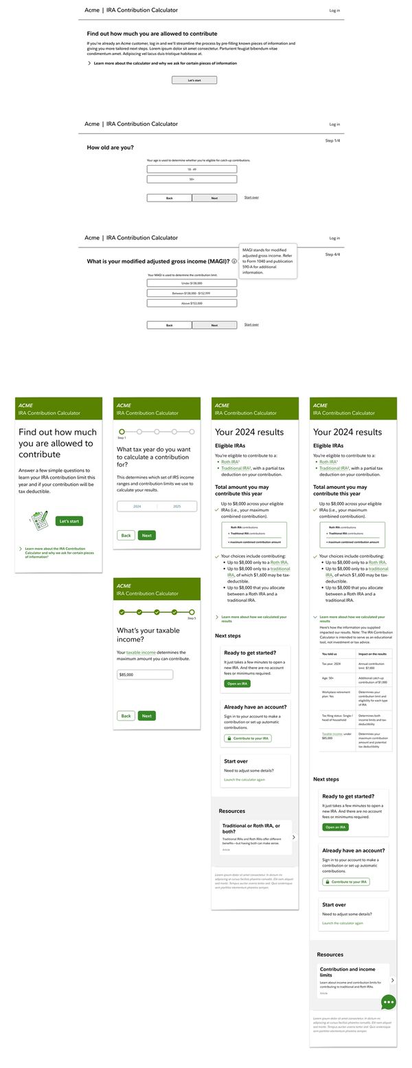
Wireframes, Testing, Detailed Design
- Next step was to create wireframes and test those with users from the target audience to determine any areas for improvement before proceeding to detailed design.
- The wireframes went through several iterations based on evolving requirements and insights from user testing. I created versions of the wireframes for desktop and mobile devices (desktop version shown here on top)
- The general approach to the calculator experience that resonated best with our target audience was a "wizard", with one simple question shown at a time. Details are initially "tucked away" and only revealed as needed, making the interface clean and simple.
- Since there was previously confusion related to the different types of IRAs and how much you may contribute to each, the new results page explains more clearly what the different account types are and what your options are for making contributions to one or both of the account types.
- There is also a section that explains "how we calculated your results". I consider this a key part of the experience, as it adds transparency, helps to educate and build trust with users.
- See the live IRA Contribution Calculator
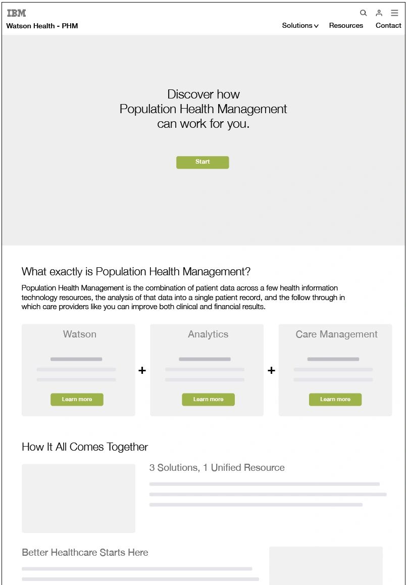
Population Health Management
New Website Design
THE CHALLENGE
- I partnered with the agency Havas Creative to lead user experience design of the new “Population Health Management” (PHM) website, the first of a series of websites under the new Watson Health umbrella.
- This included coming up with a strategy for a phased transition from existing web properties of companies purchased by IBM to the new PHM website.
- My main task was to work with the client and peers in strategy, design and development to come up with the best user experience, both for the short term (with multiple web properties) and the long term (with a single web property).
MY APPROACH
- Plan and conduct stakeholder interviews
- Conduct story mapping sessions with the internal team that leveraged existing personas
- Create scenarios, storyboard, site map and wireframes
DELIVERABLES
Story mapping output, storyboards, site map and wireframes


Story Mapping
- Story Mapping is a pretty straightforward group exercise. You round up your team members and talk about the user’s journey through your product.
- Ideally you would include clients and even users, but in this case we had to make do with the internal team.
Storyboards
- I like to give a high level depiction of the experience before honing in on the details shown in wireframes and prototypes.
- This helps to get the team on board and ensure that no crucial items are missed.
Cloud Service Delivery Platform
Vision for SaaS Transformation
THE CHALLENGE
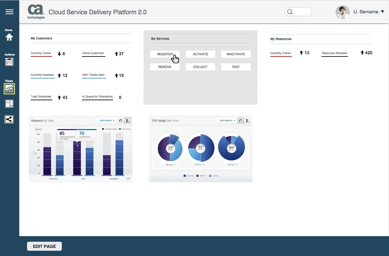
- CA Technologies engaged me to come up with the vision for the new “Cloud Service Delivery Platform”, that gives service providers a standardized way to manage their customers, services and resources. In particular, the service provider tasks included subscribing to services, deploying and monitoring services.
- Main task was to work with the team and a representative set of clients to improve the frontend user experience.
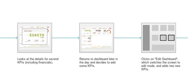
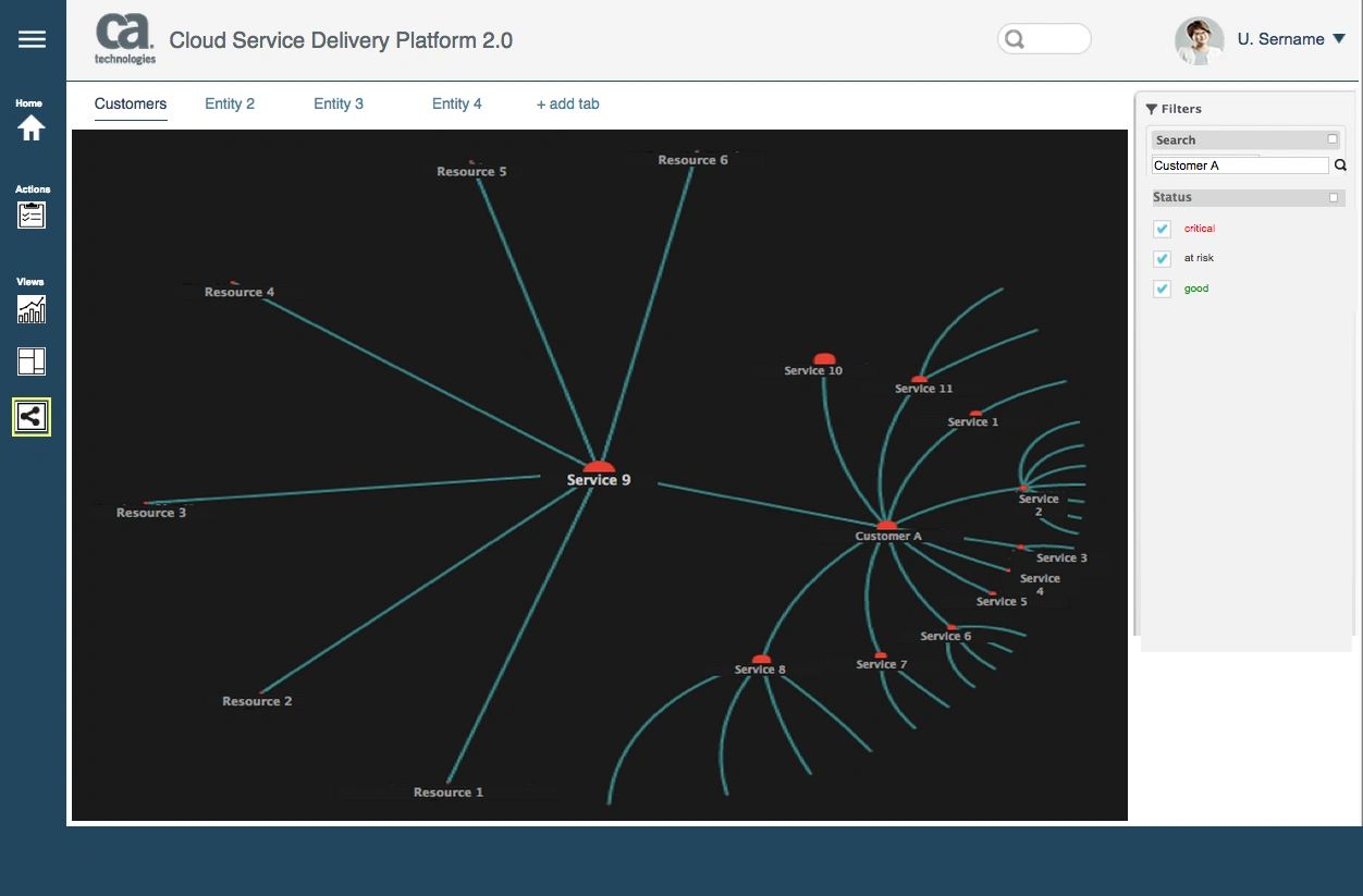
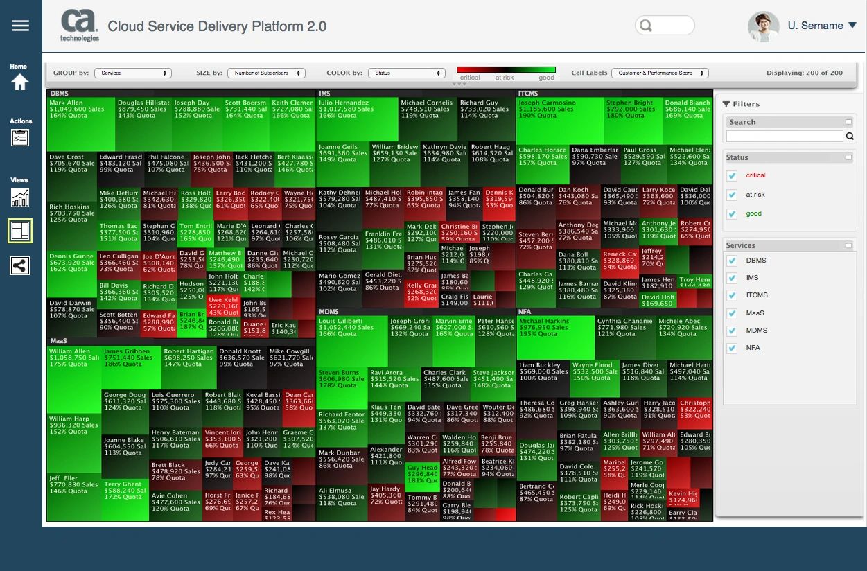
- This included exploring a wide range of advanced data visualization options, such as: dashboards with relevant KPIs / charts / graphs, “tree map” views and “hyperbolic tree” views to simplify how users process large amounts of data in a short amount of time.
MY APPROACH
- Get familiar with the existing platform, as well as the initial version of the new SaaS platform.
- Lead workshops with dozens of client stakeholders in three cities in the U.S. to come up with top user needs and tasks to include in the personas.
- Explore advanced data visualization techniques used for large and frequently changing data sets.
- Create detailed personas, storyboards, wireframes and a clickable prototype.
DELIVERABLES
Interview guides for workshops, personas, clickable prototype and annotated wireframes
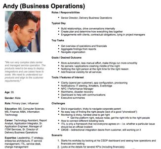
Personas
- I traveled to three U.S. cities and conducted workshops with a range of subject matter experts from top partners of CA Technologies.
- The data gathered in these workshops led to detailed, actionable personas that were much more valuable than the "made up" personas I've seen on many projects.
Storyboards
- Often times, I hand-sketch storyboards and go straight to creating wireframes from there.
- On this project I had the time to turn those rough sketches into higher fidelity storyboards, which gave a better preview of the final screens.
AVAYA.com
Rebranding & Global Website Redesign
THE CHALLENGE
- Avaya is a global leader in business communications systems. The company provides unified communications, contact centers, data solutions and related services directly and through its channel partners to leading businesses and organizations around the world.
- In 2008 the Avaya Marketing team asked R/GA to change the branding and digital experience of Avaya.com and to define a social media strategy.
- The Interaction Design team that I led was asked to conduct user research, create personas, identify top user scenarios, create wireframes for the pitch, and to create site maps and final wireframes for the redesign.
MY APPROACH
- Lead Creative Discovery phase (user interviews, personas, competitive analysis)
- Assist with user scenarios and wireframes for a pitch presentation to Avaya senior management.
- Lead R/GA Interaction Design team and oversee creation of flows diagrams, site maps and wireframes.
- Collaborate with R/GA Emerging Technologies team to define a social media strategy for Avaya.
DELIVERABLES
- User interviews and personas.
- Pitch documentation (user scenarios and wireframes)
- UI specifications (site maps and over 150 annotated wireframes)
- Social Media Strategy presentation to senior management.

Annotated Wireframes
- On a "waterfall" project like this one, it was important to create very thoroughly annotated wireframes for hand-off to development. I acted in both a hands-on and oversight role to produce over 150 pages of wireframes using InDesign.
- This particular example shows part of the Business Partner Locator search feature, which included the integration of both Salesforce data and Google Maps.
Production Site Map
- Unlike many site maps that are more high-level / conceptual, I created more of a "production-friendly" site map.
- I used color-coding to depict when each type of content or functionality would go live over the course of a multi-year rollout.
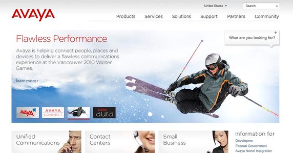
Final Design
- The final site design included a cleaner home page, simple navigation and featured marketing content.
- It also included a new "Finder" tool to give users instant access to the most relevant content.